![]()
![]()
![]()

- 2021/05/25
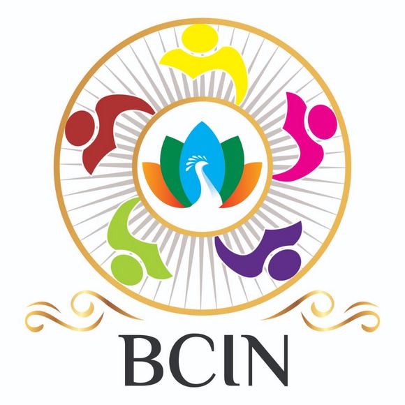
BCIN LAUNCHES ITS NEW LOGO
Bridge Club India(BCIN) has launched its new logo. This logo represents all our values as a Bridge Club and also represents our country India very well. The logo has a very interesting meaning behind it. The five humanoids in the logo represent our five zones: North, East, West, South and Central. The five zones make BC India as one. Lotus and Peacock are our national flower and bird respectively. The spokes and the colour of the lotus are designed after the Indian National Flag. We are also rebranding ourselves to "BCIN" to easily distinguish us. The logo was conceptualised by Rishika Sethiya, JA 2019. Nishant(JA2014, PA 2021) and Suraji (JA2008, PA 2021) had also made immense contributions to bring it to fruit.